4th Grade
Printmaking
Printmaking is an artistic process based on the principle of transferring images from a matrix onto another surface, most often paper or fabric. Traditional printmaking techniques include woodcut, etching, engraving, and lithography, while modern artists have expanded available techniques to include screen printing. We will be using Styrofoam plates.
|
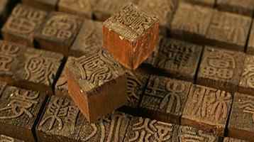
The history of printmaking began in Han Dynasty China. The earliest known example, a woodblock print on silk, has been dated sometime during the Han Dynasty from 206 B.C. to 220 A.D. The first print on paper was made during the seventh century. The original form of printmaking used a small wooden board as the matrix.
|
Pop Art
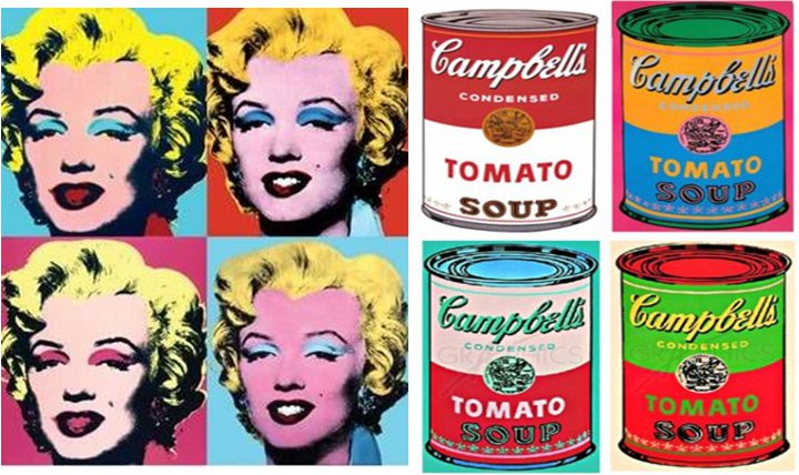
Printmaking has been an art form that has been used throughout our history. Many have used this way to reproduce their art. But, recently, the art world exploded when Pop Art commercialized Printmaking, mainly by artist Andy Warhol.
Pop Art is based on modern popular culture and the mass media, especially as a critical or ironic comment on traditional fine art values.
|
Andy Warhol is one of the greatest Pop Artists in history.

|
A few of his famous pieces...
|
Pop art is an art movement that emerged in the mid-1950s in Britain and the late 1950s in the United States. Among the early artists that shaped the pop art movement were Eduardo Paolozzi and Richard Hamilton in Britain, and Larry Rivers, Robert Rauschenberg and Jasper Johns among others in the United States.
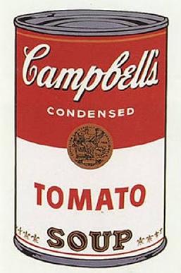
Warhol's Campbell's Soup Can print recently sold for $438,768,924!!!
|
|
We are going to learn the process of printmaking and create multiple prints of our artwork, like Warhol did. Start thinking of a logo in which you could recreate it and use it as your artwork.
Challenge: You will be creating a logo that you will then get to print multiple copies of.
Part of this challenge will be using your likes, what tells someone about who you are and conveying that message through a logo.
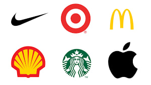
Let's see if you can tell me which company these logos belong to:
|
|
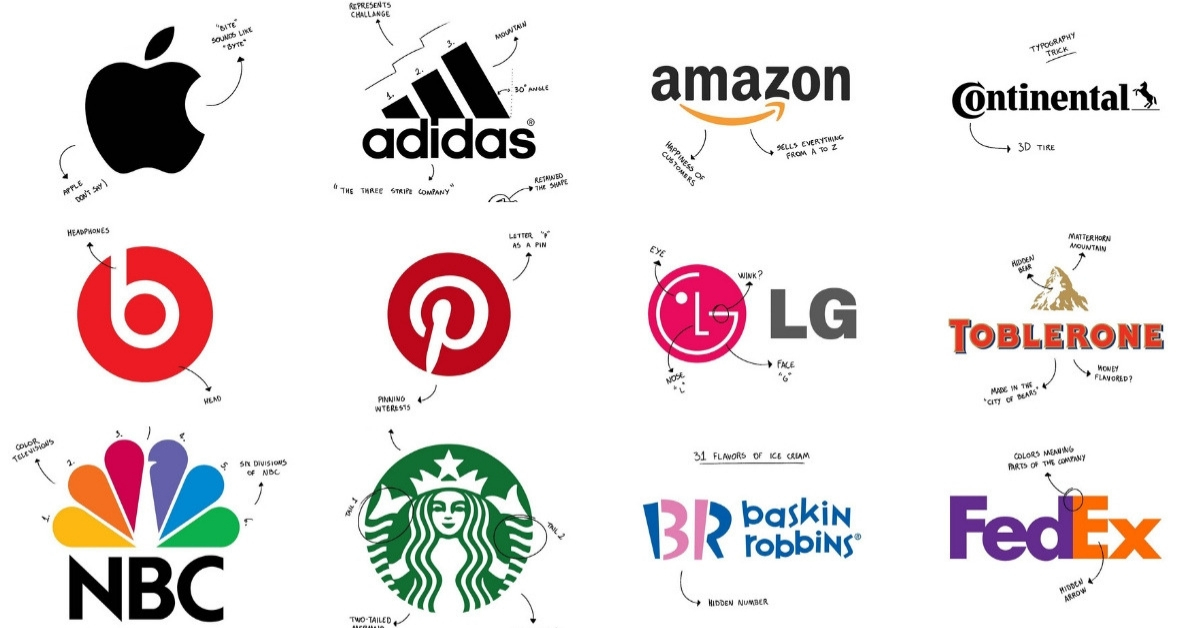
Have you ever wondered how a company got its logo?
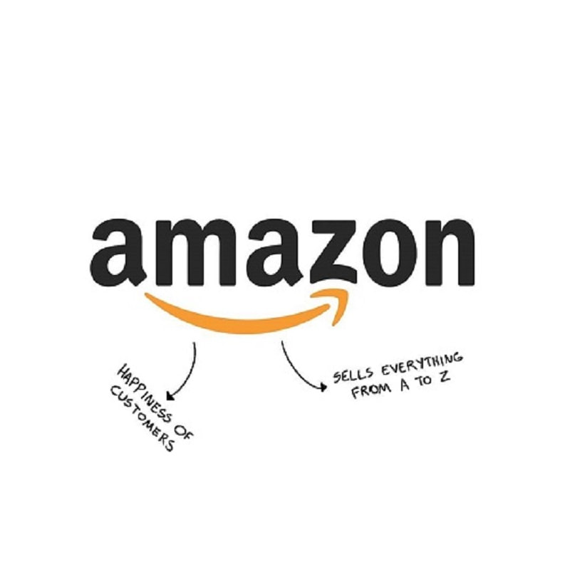
Amazon’s logo was designed to be rather simple meaning. The orange arrow serves two purposes. First, the orange arrow abstracts a smile, indicates the happiness or satisfaction of consumer when they shop with Amazon. And second, the arrow links the letters A and Z which means that the company sells absolutely every product imaginable. Simple yet effective!
|

Baskin Robbins is famously known for its 31 flavors of ice-cream. The pink-colored areas of the letter ‘B’ and ‘R’ explicitly showcased the number 31.
|
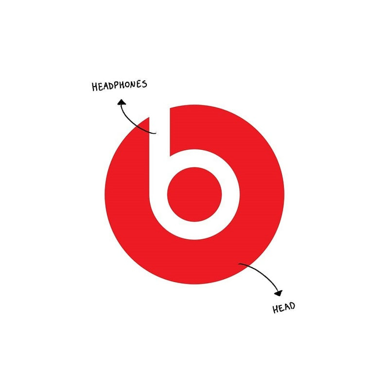
You might think that the Beats logo is pretty simple with a lower case ‘b’ comprised of a big red circle. Yet, there is more than meets the eye. The ‘b’ letter form represents a human’s head and it abstracts a person wearing headphones. Also, the red color in beats logo reflects energy, excitement and passion.
|
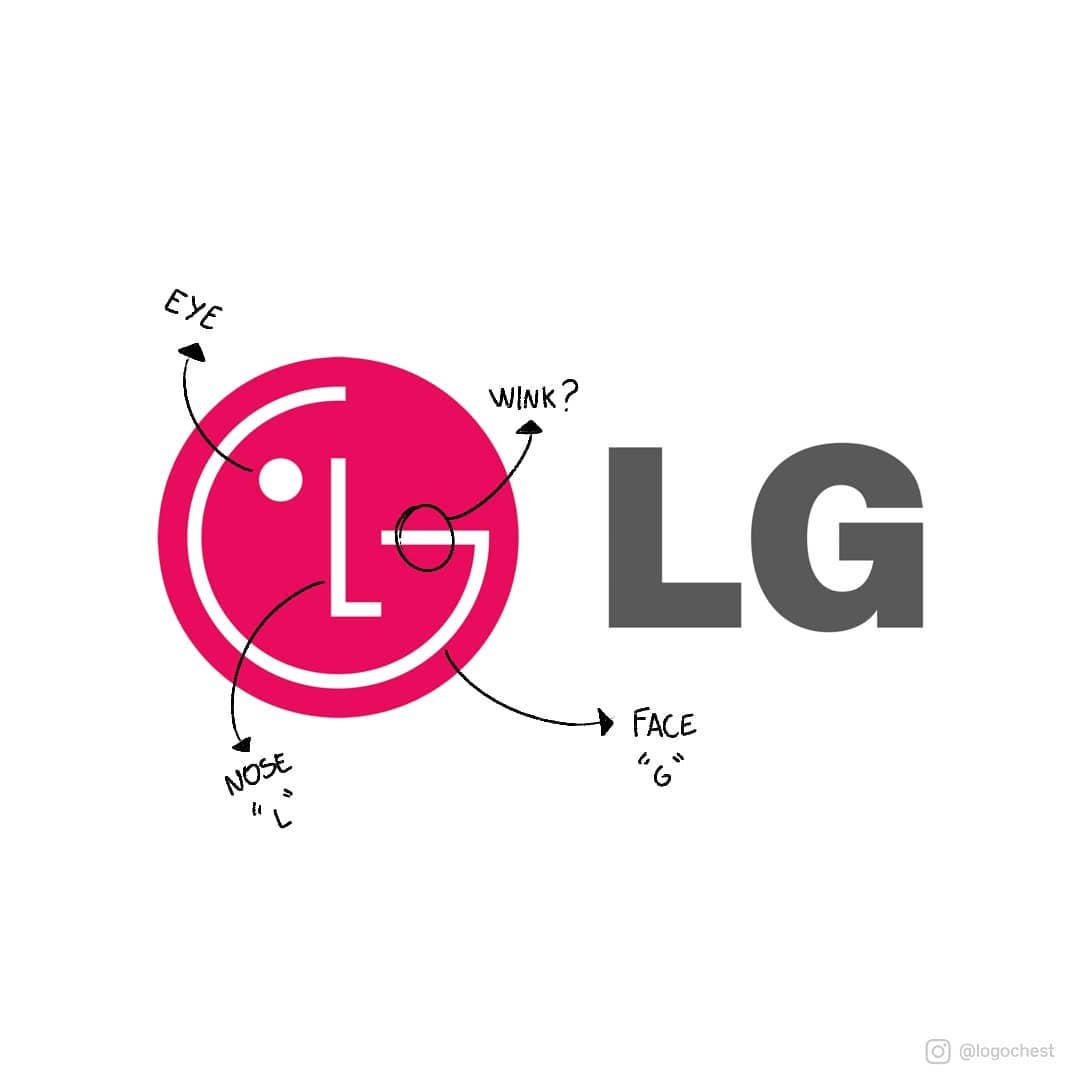
At first glance, you might think that the LG logo is nothing special. However, there is a little detail where the letter ‘L’ and ‘G’ are stylized image of a person’s face. The ‘L’ abstracts the nose and the ‘G’ abstracts the rest of the face, giving the brand a human touch.
|
You might be thinking... Where do I even start with this?
I say, be like the designers of any new logo. Take the things that mean the most to you (in a company, it would be what their main functions are) and draw up some symbols that mean the things that you like. Try to stay away from letters or words, just because they are hard to use in printmaking. Look at logos... symbols. So, if I like to paint, I might use a paintbrush. If I like to travel, I might use a plane. Once I've sketched all of the symbols of things that are about me, then I combine some of them together and come up with a logo that is for me, and no one else!
Once you have a logo.... draw it on the final draft paper (lightly!). Then, turn your paper over and draw the mirror image of what you can see on the back of the paper. Put a star on this side of the paper, because that will be the one we will use on your printing plate. You can use the window to help you see through your paper better, if you need to. You are now ready to print!
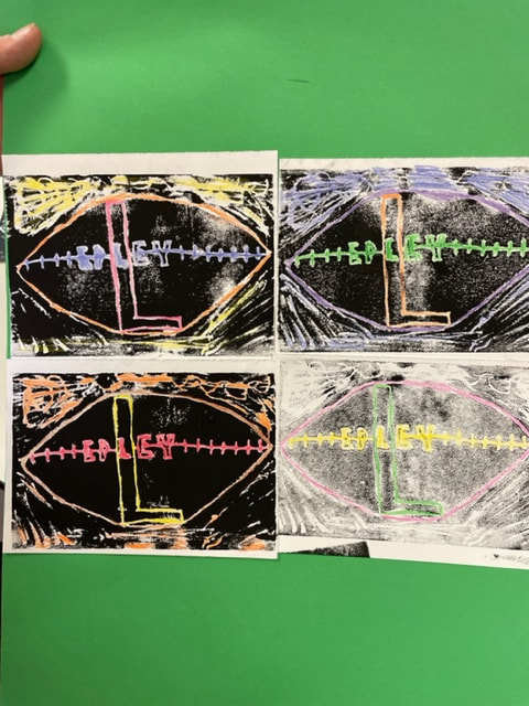
Logan Epley, Class of 2030
|

Lucas Keith, Class of 2030
|

Dominic Manning, Class of 2030
